Introduction to Power BI
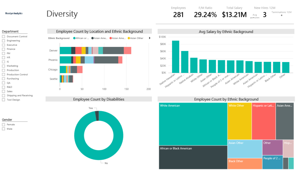
Power BI is a powerful business analytics tool developed by Microsoft, designed to transform raw data into actionable insights through interactive data visualization. This platform facilitates a deeper understanding of data by providing robust reporting features that empower users to create comprehensive dashboards and reports tailored to their specific needs. With its ability to integrate with numerous data sources, Power BI serves as a bridge between disparate data sets and meaningful analysis, allowing organizations to harness the full potential of their data.
The significance of data visualization in contemporary business practices cannot be overstated. Engaging visual representations help stakeholders identify trends, patterns, and anomalies within data swiftly. By converting complex data sets into coherent visual formats, Power BI ensures that critical information is accessible and comprehensible to users across various levels of expertise. This empowers decision-makers to react quickly, derive insights, and ultimately drive business performance.
Businesses adopting Power BI can expect numerous benefits, including enhanced collaboration through its sharing capabilities and real-time data analysis that enables timely strategic decisions. With features such as data modeling, custom visualizations, and the ability to publish reports to the web, Power BI fosters an environment of data-driven decision-making. Furthermore, its user-friendly interface allows users with minimal technical expertise to create sophisticated visualizations, making it a valuable tool for any organization seeking to improve its analytical capabilities.
To illustrate its connectivity capabilities, Power BI interfaces seamlessly with a wide range of data sources, including Microsoft Excel, SQL Server, and numerous cloud-based solutions. This versatility not only increases accessibility to various datasets but also enables users to work with their preferred tools while leveraging the analytical power of Power BI.
Installing Power BI Desktop
To begin your journey into data visualization using Power BI, the first step is to install Power BI Desktop. This software is essential as it provides a robust platform for data analysis and reporting. Follow these steps to ensure a smooth installation process.
First, open your preferred web browser and navigate to the official Microsoft Power BI website. Once there, look for the download section, which is typically prominently displayed on the homepage. Click the “Download Free” button for Power BI Desktop. This will redirect you to the download page where you can obtain the latest version of the software.
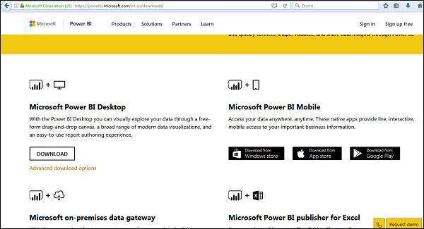
On the download page, you will see different options based on your system requirements, mostly catering to Windows operating systems. If you are using Windows, click on the download button associated with the appropriate version. The file will begin downloading shortly; this may take a few moments depending on your internet connection.
Once the download is complete, locate the installer file in your downloads folder. Double-click on the file to initiate the installation process. You might be prompted with a User Account Control (UAC) dialogue asking for permission to install. Click “Yes” to proceed.
Next, the installation wizard will walk you through a series of prompts. Review the license agreement and select the appropriate options based on your preferences. It is advisable to accept the default settings unless you have specific requirements. Once you have made your selections, click “Install.” The installation process may take several minutes to complete.
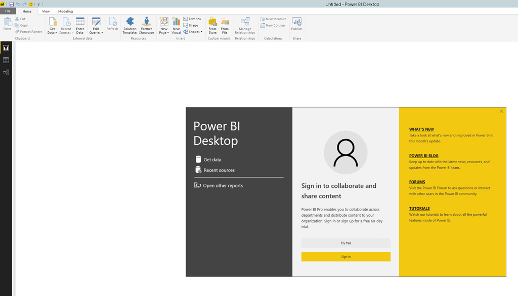
After successful installation, Power BI Desktop will offer you a welcome screen showcasing various features. This screen allows you to start your first project or explore templates available within the application. Your Power BI Desktop is now ready for use, and you can begin harnessing its capabilities for insightful data visualization.
Connecting to Your Data
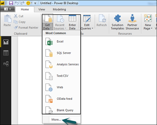
Power BI offers a straightforward interface for connecting to various data sources, allowing users to visualize their data efficiently. One of the most common methods to initiate this process is by connecting Power BI to an Excel file. To begin, open Power BI Desktop and navigate to the “Home” tab. Click on the “Get Data” button, where a wide array of data source options will be presented. Select “Excel” from the list, then browse your local files to find and select the desired Excel document. Once selected, you can preview the data and choose which specific tables or ranges to load into Power BI.
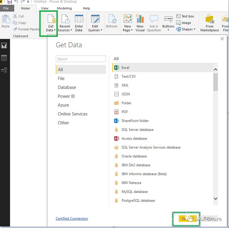
In addition to Excel files, Power BI supports a variety of data connections that can enhance your reporting capabilities. Utilizing the “Get Data” feature allows you to connect to SQL databases—both on-premises and in the cloud. For SQL Server connections, you will need to provide the server name and the database name during the connection setup. After entering the necessary credentials, you will be able to access and import data tables directly into your Power BI workspace, enabling you to leverage the powerful features offered by both tools.
Moreover, Power BI also accommodates web-based data sources. By choosing “Web” from the “Get Data” options, users can input the URL of the webpage containing the data. This method is particularly effective for drawing in data from APIs or other online databases. Importing these data sets allows for comprehensive analysis and visualization without the need for manual data entry. Overall, understanding how to connect to various data sources is a fundamental step in mastering Power BI and unlocking its full potential for data visualization.
Creating Your First Visualization
To embark on your journey in data visualization with Power BI, the first step is to choose a suitable visualization type from the visualizations pane. Power BI offers a diverse array of visualization options, such as bar charts, line charts, pie charts, and tables, which can help convey your data insights effectively. To start, ensure that you have your data loaded into Power BI from your preferred source, be it an Excel workbook, a database, or another compatible format.
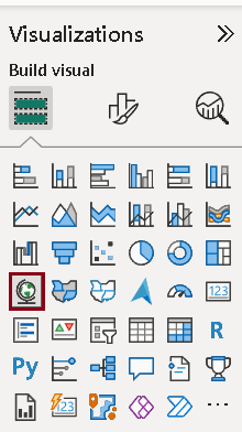
Once your data is available, navigate to the visualizations pane located on the right side of the Power BI interface. Here, you will see various icons representing the different types of visualizations. Selecting the icon for your chosen visualization type will create a blank visualization space on your report canvas.
Next, you need to populate your visualization with relevant data fields. Simply drag and drop the desired fields from the fields pane into the appropriate areas within the visualization. Each visualization type has specific slots for data such as ‘Axis,’ ‘Values,’ or ‘Legend.’ Make sure to allocate the data correctly to enable the visualization to function optimally. For instance, in a bar chart, the categorical data should be placed in the ‘Axis’ field, while the measure or numerical data belongs in the ‘Values’ field.
Importantly, customization plays a key role in enhancing the presentation of your visualization. After setting up your data, explore the options available in the visualization format pane. You can adjust colors, styles, labels, and legends to improve clarity and aesthetic appeal. Always aim for a clean and professional look to engage your audience effectively. By following these steps, you will successfully create your first visualization in Power BI, laying a solid foundation for more advanced visualization projects.
Customizing Visualizations
Customizing visualizations in Power BI is crucial for effectively conveying your data insights. Tailoring the aesthetics of your visuals not only enhances comprehension but also engages your audience. Power BI offers a wealth of options to adjust colors, styles, and formatting to better meet your presentation needs.
One of the first steps in customization is modifying the color scheme of your charts and graphs. Power BI allows users to select from predefined themes or create a customized palette that aligns with an organization’s branding. For example, changing the colors of a bar chart to match company colors can help in creating a cohesive reporting experience. When selecting colors, it’s wise to choose those that contrast well for better visibility, especially in multivariate displays.
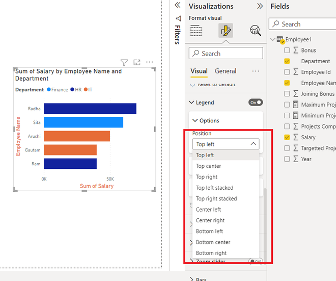
Another key feature is the addition of data labels, which enhance the clarity of your visual data representation. Labels can be configured to show information such as values, percentages, or even categories. This customization is particularly useful in pie charts and line graphs, where specific data points may need emphasis. For instance, adding a data label to a segment in a pie chart can draw attention to critical insights, facilitating quicker data interpretation.
Additionally, Power BI provides options for adjusting formatting attributes, including font size, style, and alignment. Enhancing these aspects can significantly impact how information is perceived. Organizing your visuals through alignment and consistent font usage ensures that your reports look professional and polished. You can also explore the tooltips feature, which allows users to hover over elements to receive more detailed data points.
Overall, customizing visualizations in Power BI is an essential practice for anyone looking to present data clearly and engagingly. By utilizing these features like color modification, data labels, and formatting options, users can inspire their projects and communicate insights more effectively.
Publishing Your First Report
To begin your journey in data visualization with Power BI, the first essential step is to create an account on the Power BI service platform. This online platform is crucial for sharing your reports with others and collaborating on data insights. Start by visiting the official Power BI website, where you can easily navigate to the sign-up section. Ensure to provide valid credentials and complete any necessary verification steps. Once registered, you will have access to your Power BI workspace, a centralized location where all your reports and datasets will be stored.

After setting up your account, the next phase involves publishing your first report. Power BI Desktop provides a seamless experience to transform your data into insightful visualizations. Open your Power BI Desktop application, and load the dataset you wish to analyze. Following this, create your visual elements such as charts, tables, and maps to represent your data effectively. Save your progress regularly to maintain your work.
When your report is ready, the publication process is straightforward. In the top menu of Power BI Desktop, locate the ‘Publish’ button. Upon clicking, you will be prompted to select the workspace in which to publish your report. Choose your workspace and click ‘Select.’ At this stage, you may be prompted to sign in to your Power BI account again. After successfully logging in, Power BI Desktop will start publishing your report to the Power BI service. For visual guidance, screenshots of the login interface and the publish button in Power BI Desktop can be invaluable resources.
Upon successful publication, your report will be accessible in the Power BI service, allowing you to share it with colleagues and stakeholders. This marks a significant milestone in your data visualization journey, as you now have a report live on the web, ready for insights and collaboration.
Tips for Effective Data Visualization
Creating compelling data visualizations in Power BI requires an understanding of best practices that enhance readability and comprehension. One of the most critical aspects of effective visualization is selecting the appropriate type of chart for your data. Different data sets necessitate different representation methods. For instance, if you are comparing categories, bar or column charts are often ideal. Conversely, line charts may be more suitable for displaying trends over time. This tailored approach not only communicates the message more clearly but also engages the audience effectively.
Clarity is fundamental in data visualization. This can be achieved by avoiding clutter and extraneous information that may distract or confuse the viewer. Emphasizing key data points and reducing the number of elements in a visualization can lead to a more streamlined and impactful presentation. Use contrasting colors to highlight important trends or results, but ensure the color palette is accessible to individuals with color vision deficiencies. Tools like Power BI offer several colorblind-friendly palettes that can help maintain inclusivity.
Moreover, providing context to your data is crucial. Labels, titles, and legends that are clear and concise will guide viewers in interpreting the information presented. Annotating specific data points or features can also enrich the audience’s understanding, allowing them to derive insights without extensive background knowledge. Incorporating interactive elements, such as tooltips or drill-through options in Power BI, enables deeper engagement and allows users to explore data at their own pace.
Lastly, always consider the audience’s needs when designing visualizations. Accessibility principles should be embedded in the visual design process to ensure that all users, regardless of their abilities, can access and interpret the information effectively. By adhering to these guidelines, you can enhance user proficiency in presenting data insights clearly and effectively utilizing Power BI.
Common Challenges and Troubleshooting
Getting started with Power BI can be a rewarding experience, but it also poses several challenges for new users. One of the most common issues arises when establishing data connections. Users may find that their data sources are not supported or that they face difficulties while trying to authenticate access to those sources. It is essential to ensure that the data source is correctly formatted and compatible with Power BI. Additionally, users should verify the credentials required for access and check if there are network-related issues that could impede connection.
Another prevalent challenge involves visualization methods. Power BI offers a wide array of charts and visuals, and selecting the most suitable one for your data can be daunting. New users often struggle to understand which visuals best represent their data, leading to ineffective displays. To mitigate this issue, it is recommended to familiarize oneself with the different types of visuals available and to experiment with various options to see which ones effectively communicate the intended message. It’s crucial to follow best practices in data visualization, including maintaining clarity, simplicity, and focus on key insights.
Publishing reports can also be problematic. Users may encounter difficulties when trying to share their insights with team members or stakeholders. These issues often stem from inadequate permissions, which can prevent reports from being published to the Power BI service. Therefore, before attempting to publish, users should verify their account settings and ensure they have the appropriate rights. Furthermore, if reports fail to load properly or display errors, checking for any pending updates to Power BI and refreshing the datasets can prove helpful. By addressing these common challenges with strategic troubleshooting, users can foster a more efficient experience as they embark on their Power BI journey.
Resources for Further Learning
For those eager to expand their knowledge of Power BI, a variety of resources are available that cater to different learning preferences. The official Microsoft documentation serves as a foundational resource, offering comprehensive guides and tutorials that cover all aspects of Power BI, including data modeling, visualization techniques, and DAX (Data Analysis Expressions) language. You can access this invaluable resource on the Microsoft Power BI documentation page.
In addition to official documentation, online learning platforms such as Coursera, Udemy, and LinkedIn Learning provide structured courses on Power BI. These platforms often feature courses tailored for varying skill levels, from beginners to advanced users. Many courses include hands-on projects, enabling learners to apply their knowledge in real-world scenarios. A popular course like “Getting Started with Power BI” on these platforms can help you build a strong foundation in data visualization.
For visual learners, YouTube is an excellent source of tutorial videos. Channels dedicated to Power BI frequently upload content that covers specific features, tips, and tricks, making it easy to follow along. You can find video tutorials that range from introductory lessons to advanced visualization techniques.
Engaging with the Power BI community can also enhance your learning experience. Online forums such as the Power BI Community site or Stack Overflow enable users to ask questions, share insights, and connect with other Power BI enthusiasts. Participating in these discussions not only helps clarify doubts but can also inspire new ideas and techniques for your projects.
By leveraging these resources, you can ensure a comprehensive understanding of Power BI, fostering continuous learning and engagement within this vibrant community.
Conclusion and Next Steps
As we conclude our exploration of Power BI, it is essential to reflect on the key points that have been addressed. Throughout this blog post, we have discussed the foundational concepts of Power BI, emphasizing its capabilities as a robust business intelligence tool for data visualization. We explored data importing methods, the creation of interactive dashboards, and the importance of user-friendly designs to communicate insights effectively.
Applying the knowledge acquired from this guide is crucial for maximizing your proficiency in Power BI. Start by experimenting with various datasets, which will allow you to refine your data visualization skills. Power BI offers extensive data connectivity options, enabling you to use real-world data from different sources. This hands-on experience will deepen your understanding and help you become proficient in creating compelling reports that facilitate informed decision-making.
Additionally, as you become more comfortable using Power BI, consider delving into its advanced features. Explore functionalities such as DAX (Data Analysis Expressions), custom visuals, and integrating R and Python scripts within your reports. These enhancements can significantly elevate the complexity and professionalism of your data presentations.
Furthermore, it is beneficial to engage with the broader Power BI community. Numerous forums, user groups, and online resources are available where you can seek advice, share your creations, and gain insights from experienced users. Joining these communities fosters continuous learning and provides the support system necessary for enhancing your Power BI skills.
Incorporating these steps will help you build a strong foundation in data visualization with Power BI, driving your success as a data analyst or business intelligence professional. Begin your journey with Power BI today, and harness the power of data visualization to propel your career forward.